


Barrel Theory Beer Co.
-
Barrel Theory asked me to help them establish a distinctive look and feel for their craft beer packaging.
-
Building on their existing logo, I designed a template that would be flexible, easy to update, and quickly recognizable as a Barrel Theory beer even on crowded store shelves.

Maxwell Labs
-
As an exciting startup in the thermodynamics space, Maxwell Labs needed a strong brand identity that would be used on a wide variety of marketing materials as they establish themselves as experts in the field.
-
To position the company as the future of CPU cooling, I used a snowflake icon with an abstract ML in the center along with a clean sans serif font resulting in a bold, clean logo.
Beyond the logo, I created two different background images to be used consistently on all materials to establish a strong, cohesive brand identity across all touchpoints.

Prime Attachments
-
Prime Attachments wanted a rebrand that would better position them as a manufacturer of high-quality skid steer attachments.
-
As a company that fabricates their products from metal, I felt like the logo should reflect that. I chose a thick font that had a “cutout” look and put it in a shield for extra stability.
Beyond the logo, I wanted every aspect of the brand to exude toughness. With that in mind, I chose a gritty stone/metal backgrounds and came up with the tagline, “Built to be Badass”.
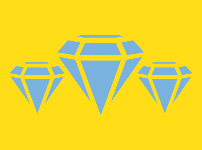
Triple Diamond
-
Triple Diamond asked me to establish a brand identity for their startup collectibles business.
-
Starting with the logo, I wanted the brand to be clean but bold. After exploring several concepts, the final logo and color palette works well on a wide variety of materials from store signage to social media posts.

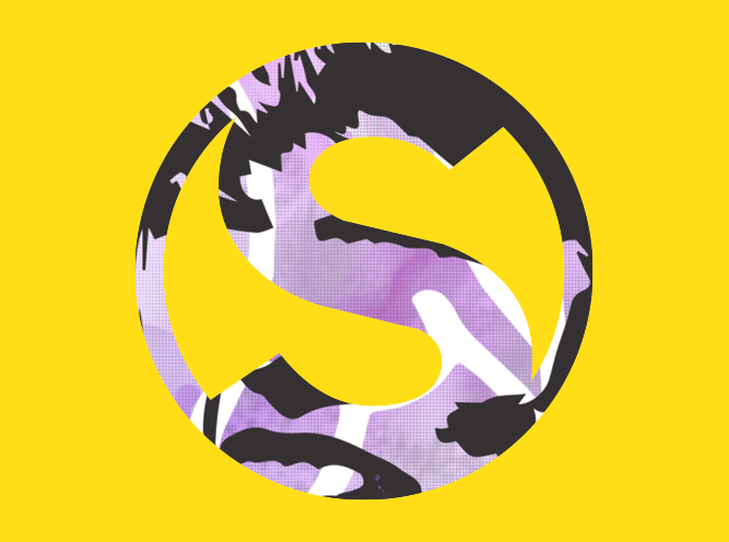
Drastic Measures Brewing
-
Before Drastic Measures opened their doors, they asked me to help them create a distinctive brand identity that would stand out in the crowded craft beer industry.
-
After kicking around a number of concepts, I landed on a logo that conveys the idea behind the name itself, while incorporating the company’s initials.
Beyond the logo:
To further reflect the brand’s personality, I chose a stylized “grunge” look for the can labels and other marketing pieces.

Ansari’s
-
As a well-respected and long-standing Mediterranean restaurant, Ansari’s frequently asks me to help them out with a variety of marketing efforts.
-
Building on their existing logo, these pieces help establish brand consistency across a wide variety of marketing channels.

Logos/Branding
-
Logo/Brand design for a variety of clients
-
I always strive to create logos that are clean, easy to read, and will work well as single color or multiple.

Illustration
-
Various illustrations I’ve done.
Misc.
-
Various projects that I’ve worked on just for the fun of it